INK!
The joyful all in one solution for every tattoo interested human.
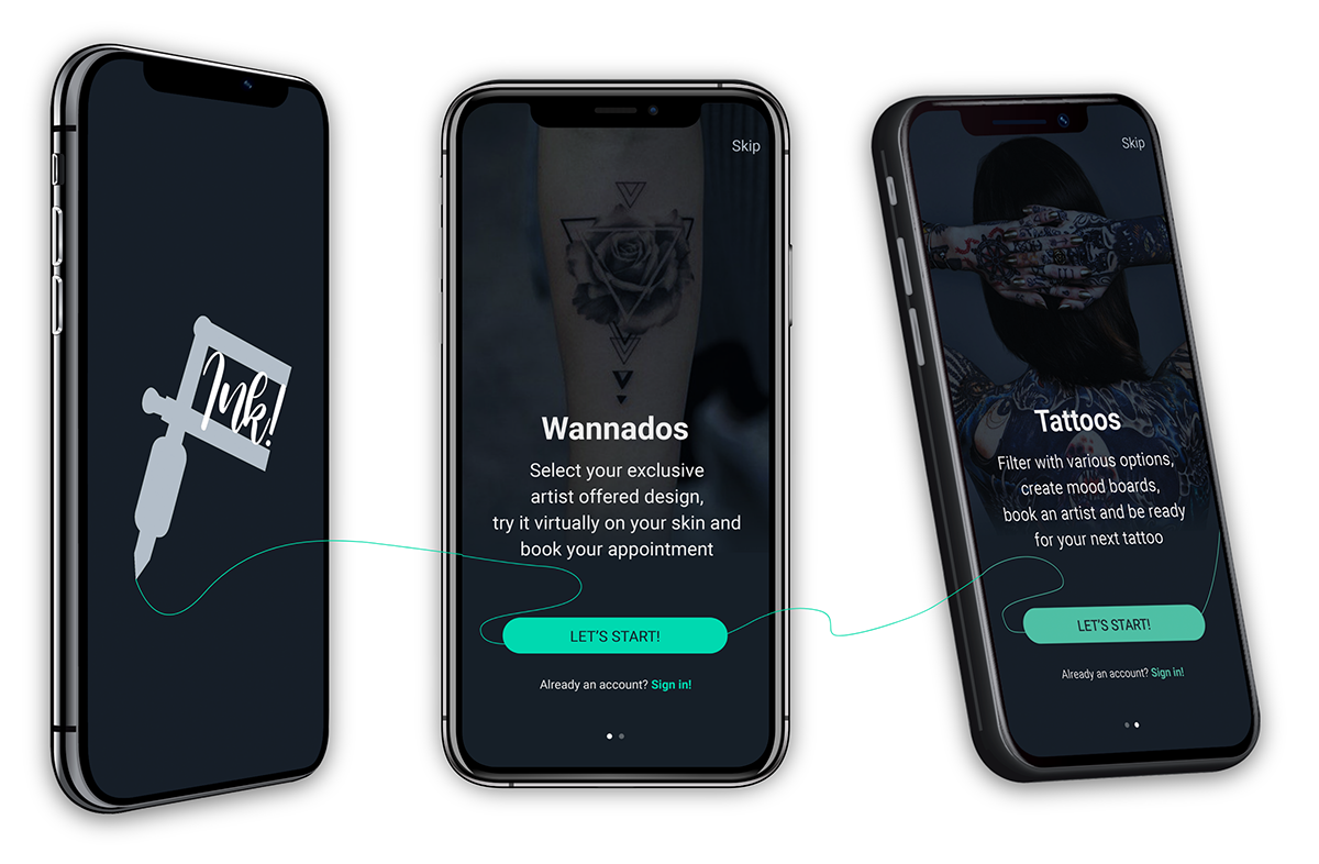
Overview
What is INK!?
The tattoo community is very divers, nearly every possible age, background and internet usage experience is possible. INK! is an app for all of these tattoo interested people that bridges the gap between tattoo newbees, long time enthusiasts and artists. It concentrates on the content, offers and organises the whole process for a user of getting a new tattoo without experiencing any pain upfront. INK! is easy to use for everyone.
Purpose and Context
I developed INK! as part of my UX Design studies at the Career Foundry. I decided to develop a tattoo app because it combines my personal preference for tattoos with the need to learn and intensify UX based content. Furthermore, my private circle of acquaintances gave me a good opportunity for user research and testing, which was an advantage in case of a first project to learn the techniques.
My Role
I was responsible for the whole process:
- UX Research
- UX Design
- UI Design
Duration
6 month
Tools
- Pen & paper
- Adobe XD
- Adobe Photoshop
- Adobe Illustrator
- Keynote
- Google Forms
- Excel
- UsabilityHub
Objectives
Problem
- It is not easy to find the right design with just an idea but not really a clue where to start.
- Even without a solid idea, people can have the urge to get a new tattoo.
- How do users find an artist who fits them? It is a private and sensitive act to get a tattoo.
- How do they secure that the chosen design looks good on the place they want it?
- How to know if an appointment is possible with the favoured artist in the near future?
- Also the pricing and payment for tattoos is often unclear.
Statement
Tattoo enthuisasts and newbees need a way to find designs, try them on, contact artists, book arrangements and cover the entire process, with the exception of tattooing itself, in one solution.
We will know this to be true, when users book appointments over the app and return later for an artist review or to start looking for a new design.
Solution
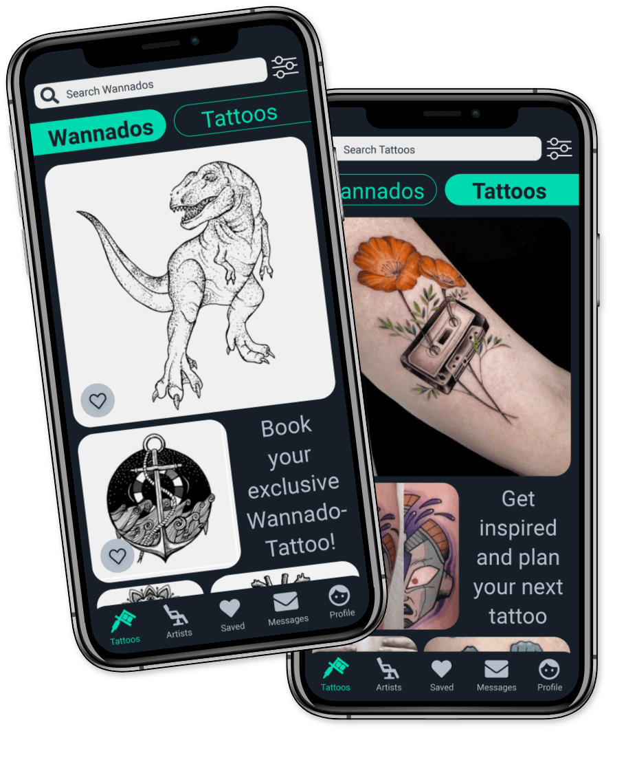
INK! allows the user to search for artist offered exclusive „Wannado“ designs, „Tattoo“ inspirations, artists and studios. To narrow down the search by filtering the relevant factors like distance, styles, ratings, price and artist availability. To check the favourite „Wannado“ design via Augmented Reality to avoid regrets. The app allows the upload of own designs to created mood boards and to share them with artists or others. The user got the chance to get to know the artist better with a detailed overview. Ratings and reviews will help too. Artists and studios can be contacted directly through an intuitive briefing and stay in contact via private message. The app offers the whole process before getting a tattoo including transparent pricing and in-app payment.
Walkthrough the App
Approach
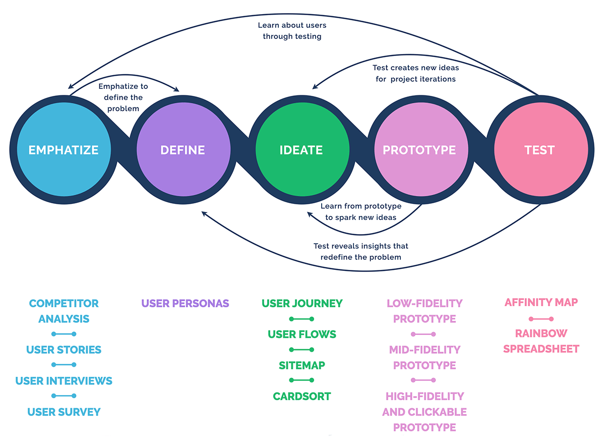
Design Thinking Process
I have implemented this non-linear design thinking process for my project, and also iterated along the way. Each phase of the process contains different parts, which are crucial for the development of the app.
Emphatize
Competitor Analysis
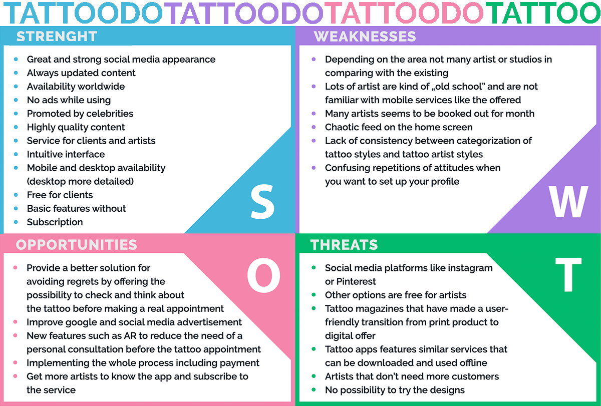
I have intensively studied the two main competitors that offer interesting features for my app. The competitive analysis offers me the possibility to filter out gaps in the market and to uncover market trends so I know how I have to develop my product and sell it more effectively.
Tattoodo
Tattoodo is rightly the market leader and has a really nice UX and UI. In the course of my app development Tattoodo has made significant changes and improved the app. Interestingly enough, based on my analyses I built the navigation in the same way Tattoodo changed it later. So in this case I was right with my discoveries and the resulting functions of my app.
Inkhunter
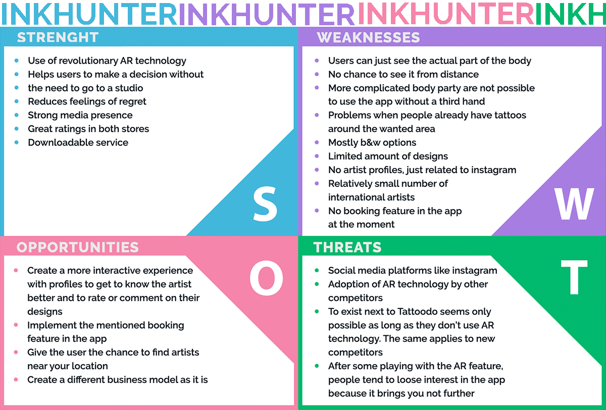
Inkhunter was also very interesting for me as a competitor, because they built in Augmented Reality as a core function, with which the user is able to project drawn tattoo templates onto the skin. Inkhunter is at the moment mainly limited to this feature, which makes it uninteresting for users who are looking for a tattoo and artist whom they can book through the app.
Swot Profile
User Stories
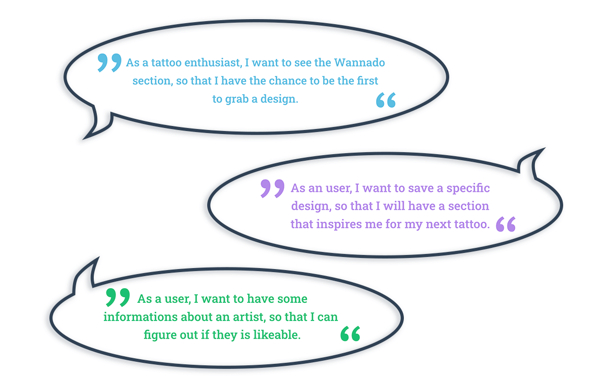
To get more clarity about the product, I have developed more than 40 user stories that help me understand what I need to develop for whom and why. These stories have given me a basis on which I could develop my interview questions. Exemplary here 3 user stories.
User Interviews
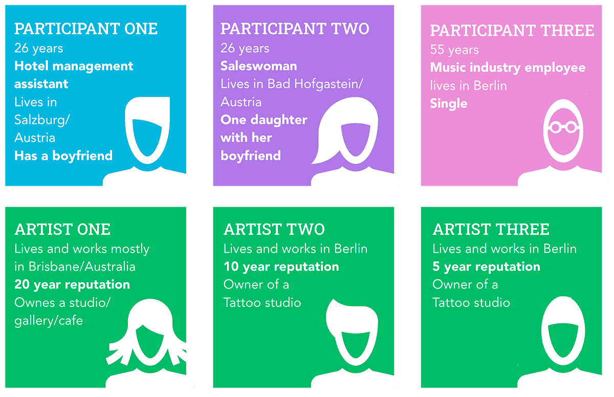
At the discovery phase of my project, I conducted three 15-questions user interviews with tattooed people (two in person, one via zoom) and three 4-question email-interviews with artists in order to get a better understanding of the problem.
Research Goals
- I wanted to discover what the intentions for a tattoo are.
- To what extent the decisions are influenced by other people.
- To find out which possibilities, including digital services people have used so far, to find a new design.
- Find out what potential users think about the use of a tattoo app and what experiences they have had.
- Which points in the process of getting a new tattoo have led to dissatisfaction.
- If tattoos were regretted afterwards and what could have prevented this regret.
Affinity Mapping
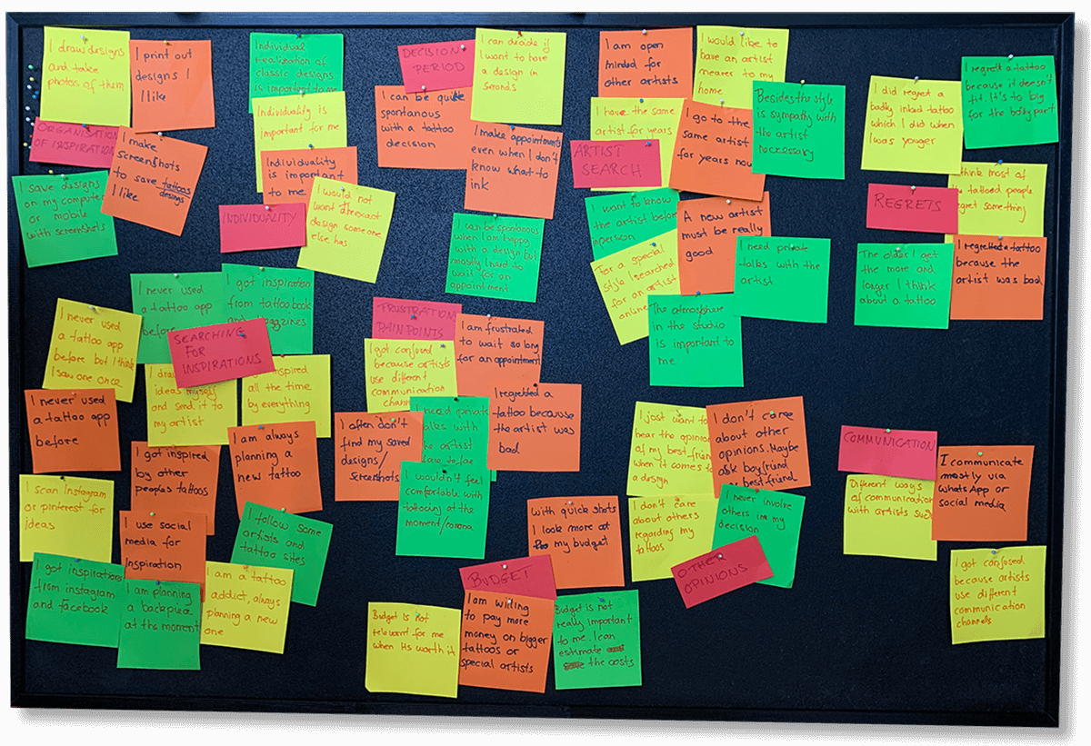
After my interviews I sorted, organized and summarized the statements with affinity mapping in order to find the matching point of views and differences. I like to visualise data in a haptic way, to let information settle in. Based on these findings I have created my User Personas in the following.
Findings
- The age or tattoo experience seems to play a role in how designs and tattoo artists are chosen.
- The first tattoos seem to be the ones most likely to regret.
- With the experience the self-confidence grows, at the same time a more relaxed spontaneity is possible.
- None of my participants were interested in what others (except close friends) thought of their ideas.
- A social media idea that allows the evaluation of other designs is not important to anyone.
- It seems to be important to all of them, however, besides ability and style, is the sympathy for their artist.
- It seems to be not easy to get an appointment with an artist in time.
- Everyone uses google, instagram and other social media services to find inspiration and artists.
- Organising ideas and inspirations seems to be relevant in any case.
- None has come in contact with TATTOODO, which is astonishing because of the market dominance.
- Artists use social media to present their work, mostly instagram.
- They communicate in different ways with their customers.
User Survey
After I analysed the finding from my interviews, I conducted a user survey with Usability Hub with a total of 21 questions.
85 people took part within 7 hours.
Research Goals
- Which possibilities tattoo interested people have used so far, and which role digital services play.
- What potential users think about the use of a tattoo app and what experiences they have had so far.
- If tattoos were regretted afterwards and what could have prevented this regret.
- Which role other opinions play in the process of planning a tattoo.
- Whether a new tattoo is always a longer process, or if there is spontaneity among tattoo interested people.
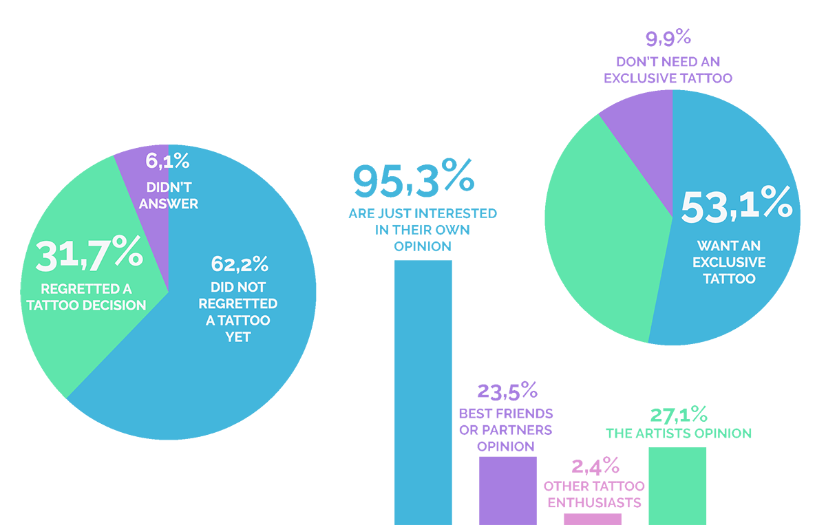
Findings
- Many of my quantitative results matched the few qualitative interviews I conducted.
- The majority of the participants did not care about other people’s opinions.Because of that, I did not implement a community idea with INK!
- The artists need a profile to get to know them.
- 65.5% of the participants would like to see a design on their body before they get the real tattoo.Thats why I implemented augmented reality to INK!.
- 20.3% said their last tattoo was spontaneous. Since only the last tattoo was asked, this is a high value.
- Most of the participants never used a tattoo app before, there is still a lot of potential in this field.
User Personas
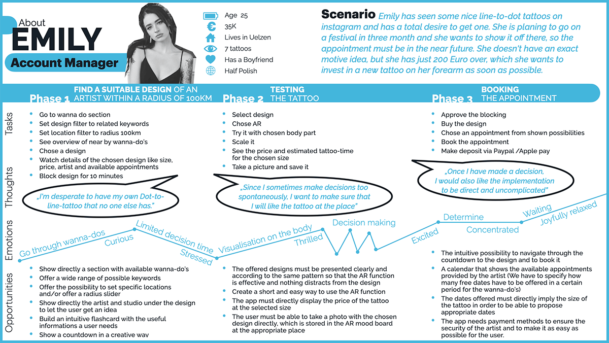
Based on the interviews and the survey I set up two user personas to give the insights a narrative, to make them memorable. I referred to them throughout the entire product development process. To show the wide range of people interested in tattooing, I have chosen Emily and Peter as Personas and would like to meet their needs with my product.
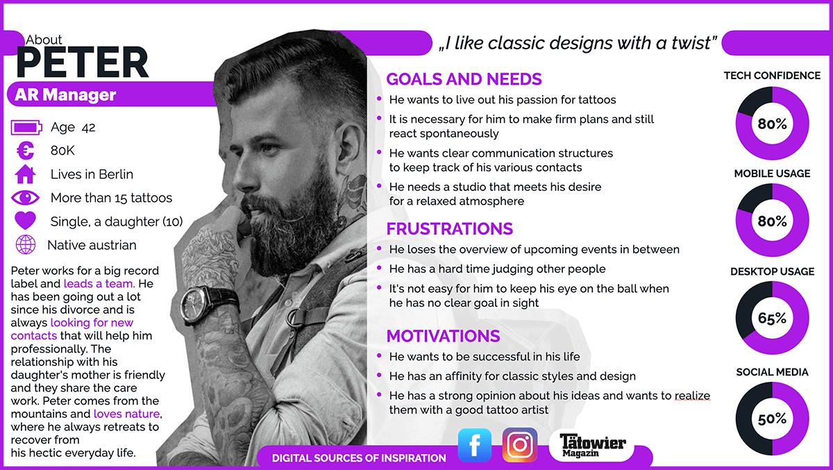
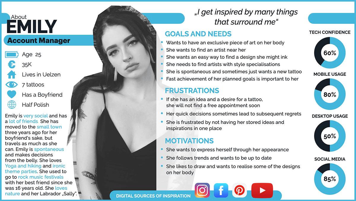
Ideate
User Journeys & User Flow
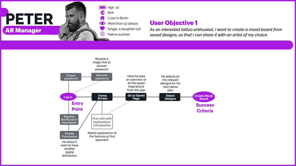
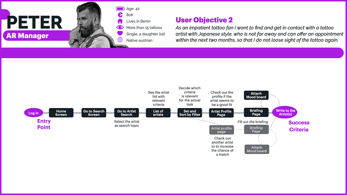
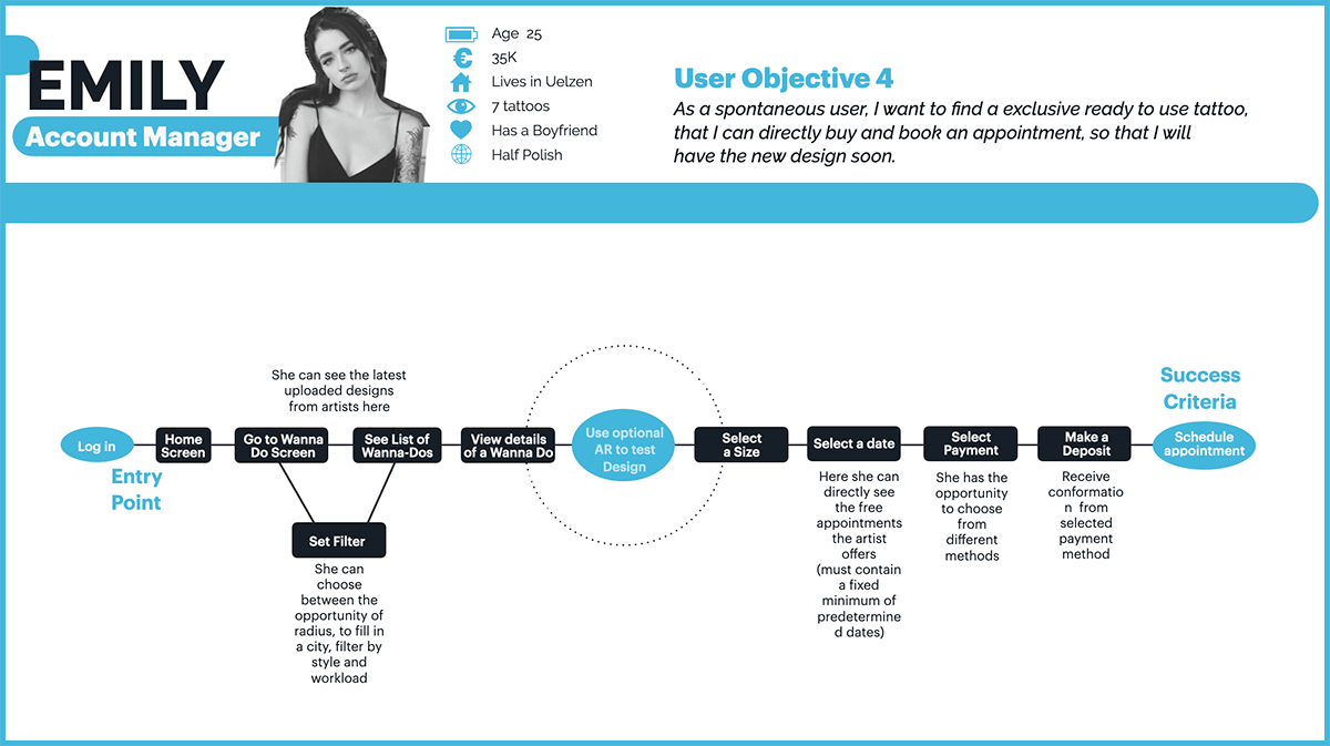
After specifying my personas, I went a little deeper to find out what steps users take and how I can simplify the journey the user takes with the product to reach their goal. I assigned certain tasks to the personas, eroded their thoughts and emotions and explained their possibilities. The goal was to identify the user’s main touchpoints with the application and to illuminate further aspects. Breaks in the application such as disappointments or unfulfilled expectations can be identified. In order to show the necessary steps I created the user flows based on the user journeys, which show the steps the user has to take to reach his goal.
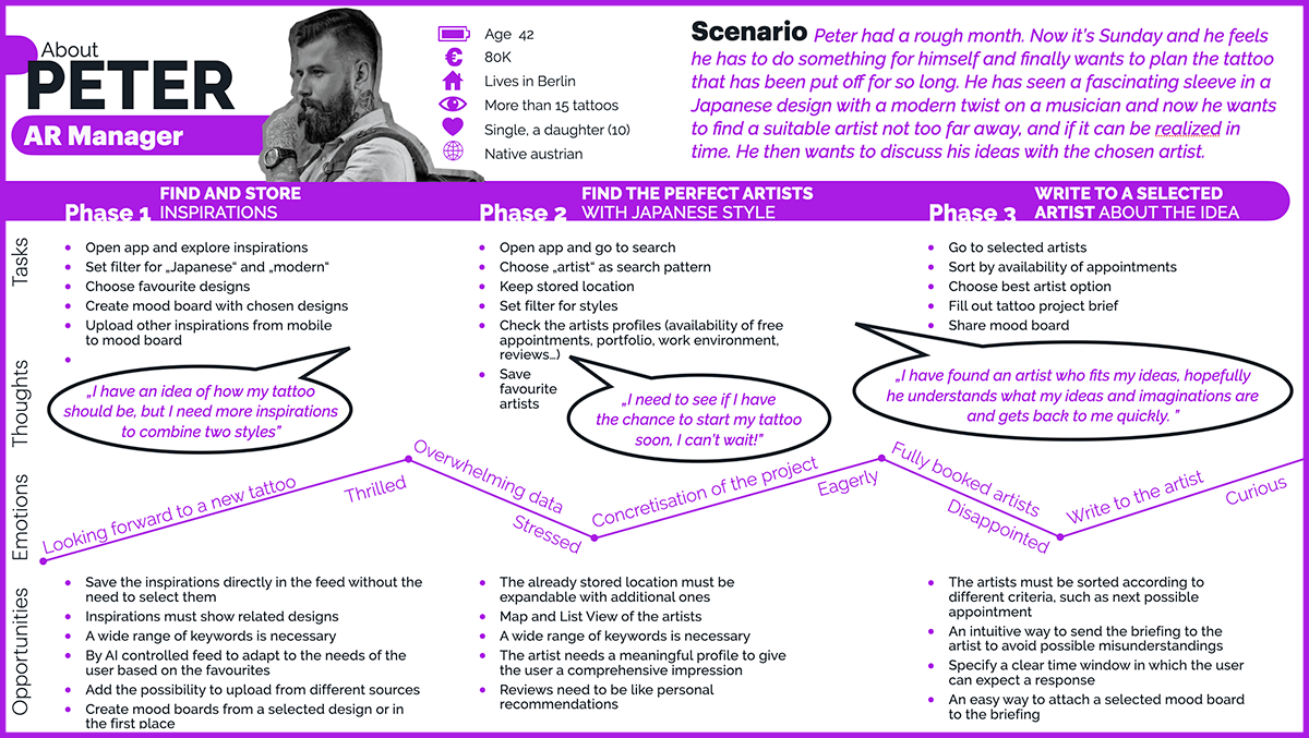
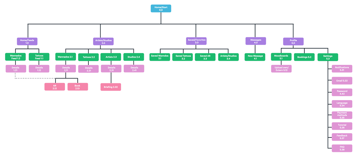
Card sorting & Sitemap
The card sorting with Optimal Sort helped me to confirm proposed assignments and to gain new insights into which features might still be important to users for quick access. I have created a set of 30 terms and features which I have presented to 24 participants as a hybrid card sorting. My originally created sitemap has been adjusted a little bit due to the results of the cardsorting and adjusted during the creation of the low-fidelity wireframes.
Prototype
Low-fidelity
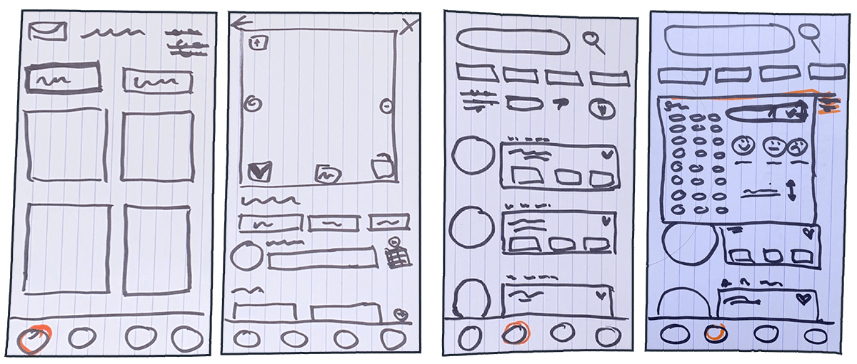
I started with simple paper and pencil sketches, because they allow a quick demonstration of the necessary functions. The fast, visual implementation directly reveals weak points and possibilities. In this case I found out that there is still room for another tab in the bottom navigation. I have scribbled different tasks, limiting the presentation to my core feature, the „Wannado“ booking process. This is a good way to demonstrate the development process of my app and I got a feeling for the arrangement of the respective elements.
Low-fidelity screen examples
Mid-fidelity
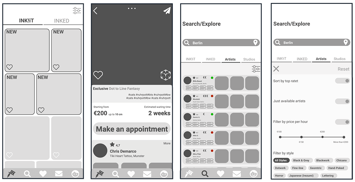
I built my mid fidelity wireframes directly in Adobe XD, so I could develop my high fidelity wireframes directly from them. This made more sense to me than to use another program like balsamique. My mid-fidelity and first attempt of high-fidelity wireframes were based on the wording „INK!it” and „INKED”, with which I started my project and changed to „Wannados” and „Tattoos” after the Usability tests. These wireframes were very useful to verify the basic structure and to work out weak points in the navigation and iconography.
Mid-fidelity screen examples
High-fidelity
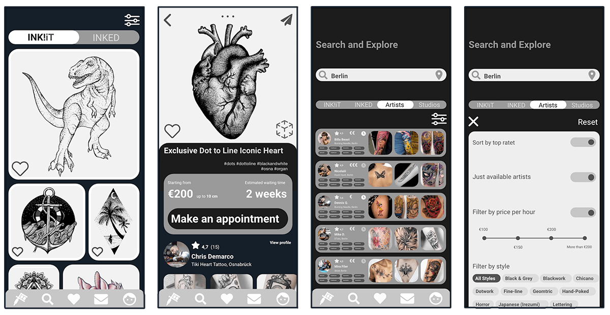
I developed my high-fidelity wireframes directly from the mid-fidelity screens to give the stakeholders more detailed information about where I want to go visually with my app. These screens were turned into a clickable prototype to test it with my users in the next step.
High-fidelity screen examples
Test
Usability Test
Before I started the final design of my app, I did a usability test. I wanted to do this as early as possible with my first prototype to take the findings with me for my further development. This way I was able to identify usability problems and fix them even before the high fidelity prototype was developed. It was important to me to create a relaxed atmosphere and to give the participants the secure feeling that their comments are very important to me, but that they are not personally on the test bench.
Goals
I wanted to assess the learnability for new users interacting with the INK!-app for the first time on mobile and to observe and measure if users understand the functions of the app, its value, and how to complete basic initial functions and main tasks. It was important for me to find out if users understand the wording of the app and if they are able to complete the tasks without friction.
Methodology
- Moderated In-Person: Three Participants
- Moderated Remote: Two Participants
Test Objectives
Onboarding and Sign up/Sign in
- Do users read the onboarding or do they skip it?
- Is it easy for them to log in or sign up?
Find an INK!iT-design with various filter options, buy it an book an appointment
- Do users realise the two feeds and understand the difference between the INK!iT and INKED-feed?
- Do they find the filter and are able to set it to the needs?
- Are they able to buy the design and book an appointment?
- Do they check the bookings in the profile afterwards?
Create a mood board from saved Tattoo designs
- Is it clear where to find saved content?
- Is it intuitive to create a mood board?
- Do they check the mood boards in the profile?
Find an artist matching users filter settings
- Is it clear where to search for the artist?
- Does the user find the filter and is able to set it?
- Does the user find an artist and knows how to get in contact?
Affinity Mapping
After the respective sessions I reviewed my notes and recordings and created a haptic affinity map, in which I captured and structured all observations, positive quotes, negative quotes and errors that occurred. In this way I was able to identify and analyze any patterns of behaviour of my participants. I created a rainbow spreadsheet then, to organise my usability test findings and create visual patterns. This allowed me to keep track of the information and make better design decisions further along the process.
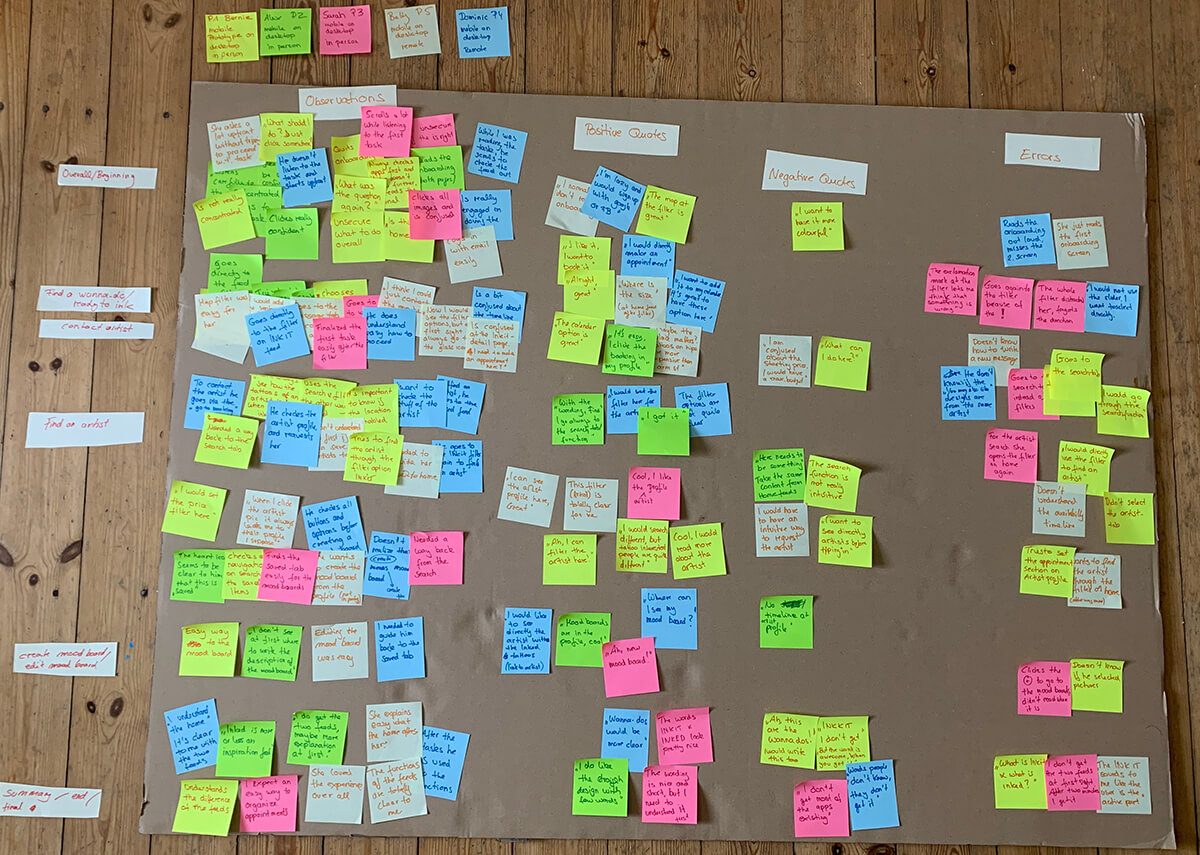
Observations
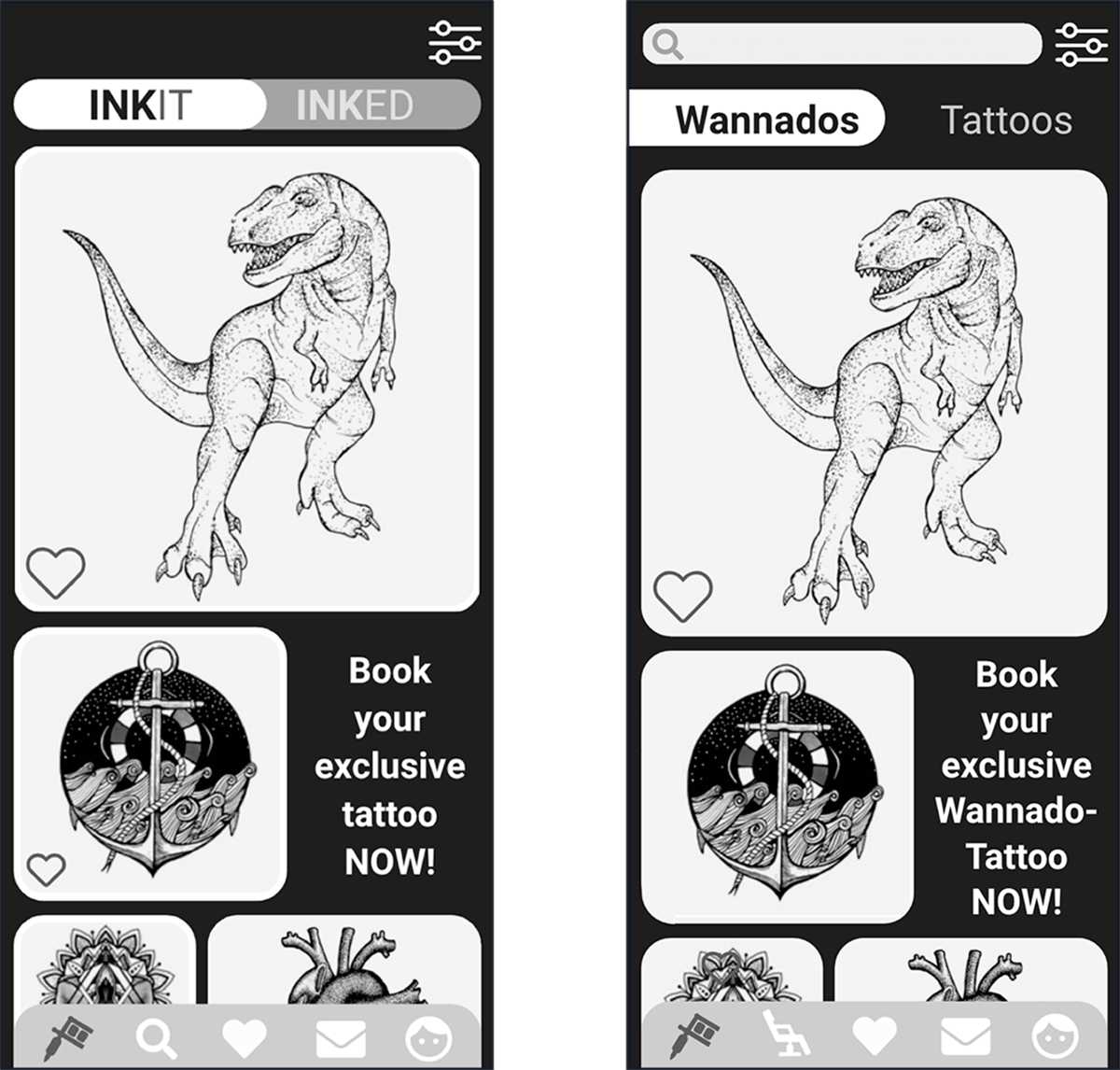
Overall the user liked the app. When skipping the onboarding and with kind of no information, they didn’t get the wording „INK!IT” and „INKED” at first glance even if they liked it. They had some issues when to use the search function and when to use the feed filter. The first two issues listed are related and resulted from the wording of the task. Nevertheless, the user must reach the results in different ways with location, filter, search function. To make this clearer, the bottom navigation was renewed as a result of the tests and the classic search tab was removed. The feeds can now be adjusted from the home page with the filter or found with the newly integrated search bar. The original search tab has been changed to find artists and studios. The participants wanted to try out more, but because it was just a first clickable prototype some actions didn’t work because of missing content.
Occured Issues 1, 2 & 4
- User clicked the search tab instead of filter
- User goes to feed filter instead of search tab
- User didn’t get what „INK!iT“ and „INKED“ mean
Severity: High
Solution: Search and filter functions have rethought. This includes a change in the bottom navigation and a search bar has been added. Wording changed to „Wannados“ and „Tattoos“.
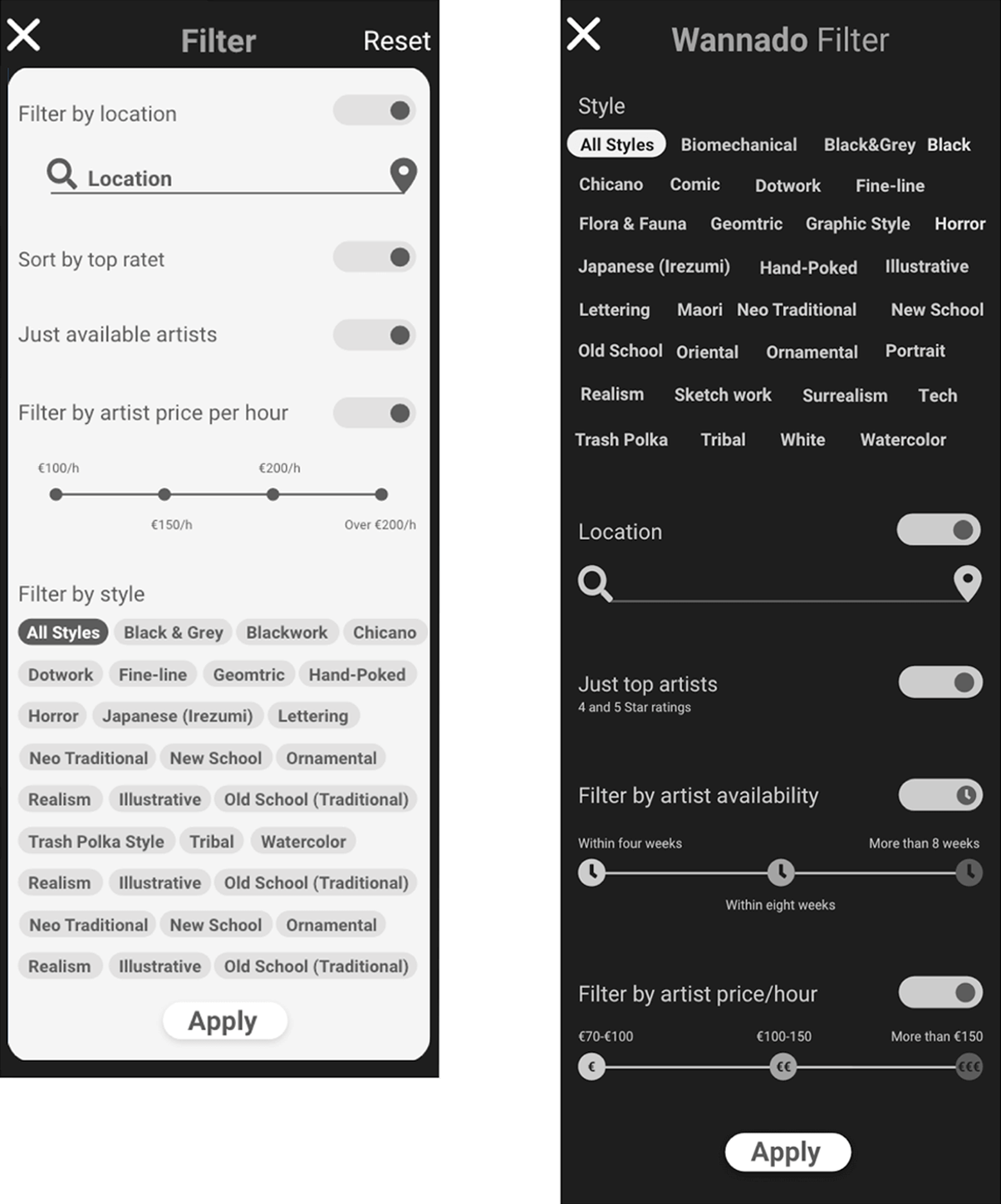
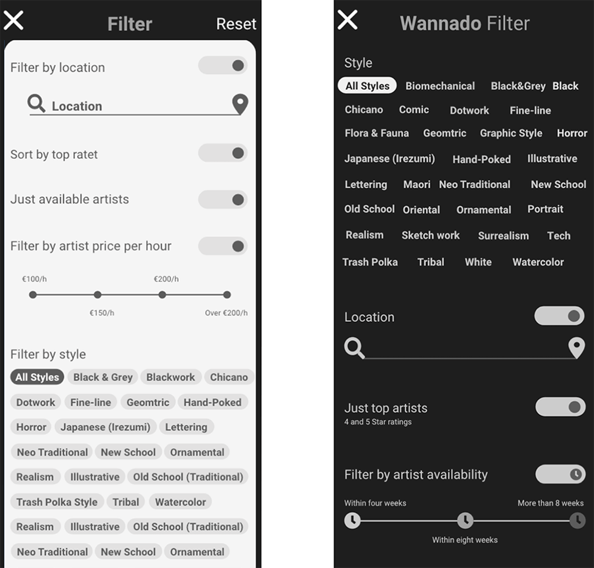
The filter changed again during the development process. The sliders turned out to be completely unnecessary, which is why they disappeared in the further process, since the user can now decide for himself which filter options are necessary and applies only these. And the location seemed to be more important so that I put it again on top after the feedback of my peers.
Occured Issue 3
- User tried to type something in the search bar without clicking the „Artist”-top tab first
Severity: High
Solution: 2nd bottom navigation tab is now a search function just for artists and studios, suggestions are now made directly.
Refine
Design Language
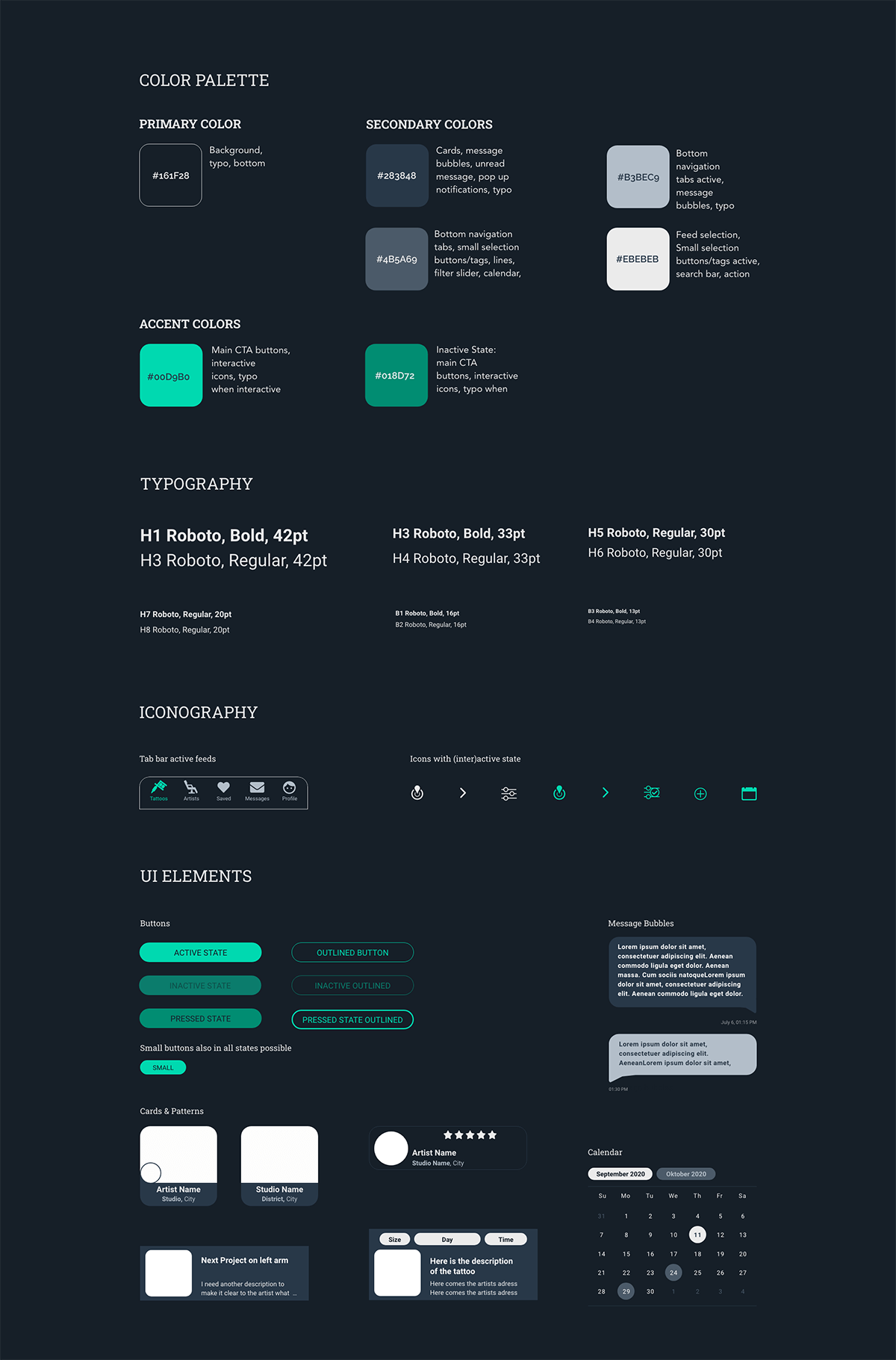
To give my app a unique but consistent look and feel, I have defined specifications that describe the selection of design aspects like color schemes, typography and Ui elements. In the further development process of my app I, or any other person who will work on my app, can then follow the scheme in the design of each object. I present here an extract of the most important elements for a final design.
Final Design
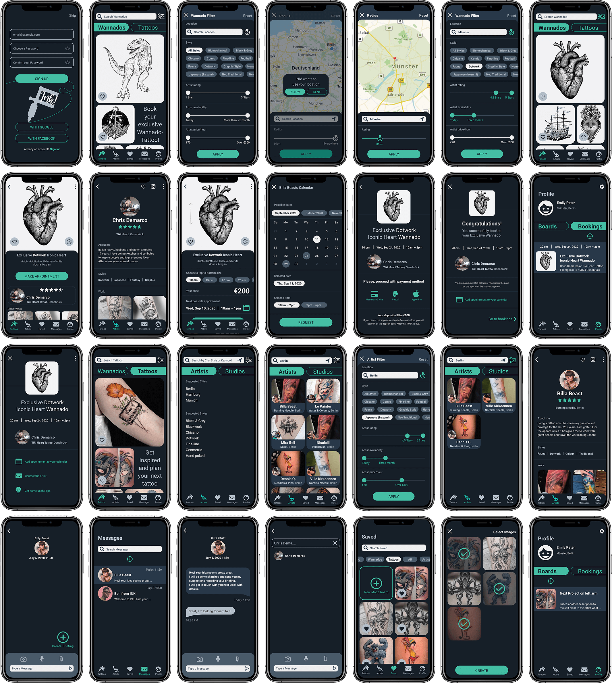
I have tested my prototype again and again and got feedback from other students and potential users. A preference test confirmed my design, but further feedback from my peers led to further changes, so the A/B testing can be neglected here. I also put my app to the test regarding ethical and accessible aspects and implemented them, which among other things led to a greater strength in typography and a rethought artist and studio search result screen. At the end of my first UX trip the final design of my app is ready. But „final“ can only be a sophisticated intermediate stage in the development process, as further feedback rounds and tests will lead to new iterations. There is always something to improve!
Conclusion
- It was interesting to find out about the differences and the consequences of native and web apps.
- For user interviews, I have to appear more professional. I have been too busy trying to explain things to my participants to take away their uncertainty.
- Card sorting has led to confusion among the participants. This was partly due to the fact that the Optimal Sort web app is not easy to use and some participants either dropped out or were logged out of the system. On the other hand, my explanation and categorization must be clearer that the user completes the task. I would probably rely more on hybrid card sorting next time.
- Finding and creating icons took me too long and I got stuck with designs that I later got rid of.
- The first time to built wireframes took me too much time. Due to my lack of experience, I spent too much time on small things and iterated everything again and again.
- The feedback of my student peers was also helpful. I would involve team members, stakeholders, or other interested people earlier to save time and to avoid dead ends.
- By developing a, in this case very visual, app, I started to think about the importance of inclusive products that are accessible for everyone and I will deal with this more intensively.
The development of INK! from the beginning, without any previous knowledge in the UX Field, has been incredibly fun. It was really exciting to learn so much about user experience design directly at the open heart. I was able to apply my knowledge instantly and to implement it in the individual mythological steps during the development process of my app. I got a deep insight into the design thinking process and was able to lay a foundation of knowledge that I am continuously expanding. It was challenging and at the same time motivating to be responsible for the whole process on my own.
